Dink Vibes is a Pickleball Girls Club that plays and attends tournaments in San Diego. Started by two Asian-American women, the logo expressed high interest in Asian influence, femininity, and “good vibes” positive energy.
Logo Development
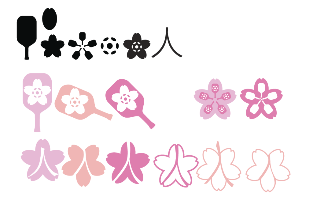
The logo sketches include Japanese sakura and pink tones to match the flower element and feminine forward identity. Within the Sakura is the Japanese Kanji “hito” which translates to “people” to add a sense of unity.
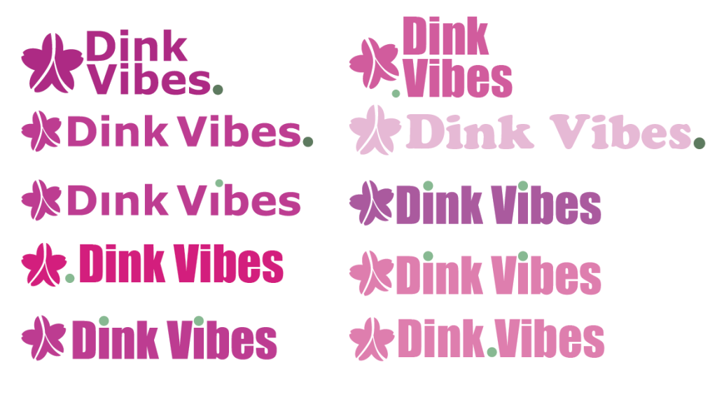
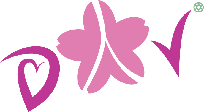

The Kanji inspired the essence of a ball bounce, much like the simulation of play in pickleball. The option expanded into logotype that incorporated the bounce as well as the “heart shaped petal” of the sakura. The final logotype serves as a marriage of both the identity of the sakura as well as the letters clearly signifying “pickleball” to the viewer with the soft incorporation of the green ball.
Graphic Elements
The Dink Vibes brand is projected to inspire women to take on a new, fun form of exercise, while sustaining their mental health by socializing with friends. The message is served by adding fun designs to incorporate into graphic tees, tournament uniforms, and general active wear.
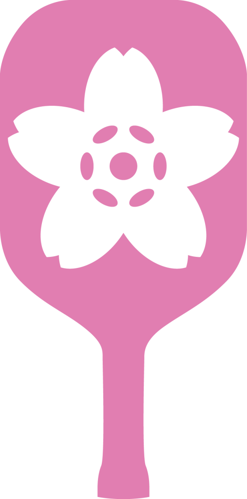
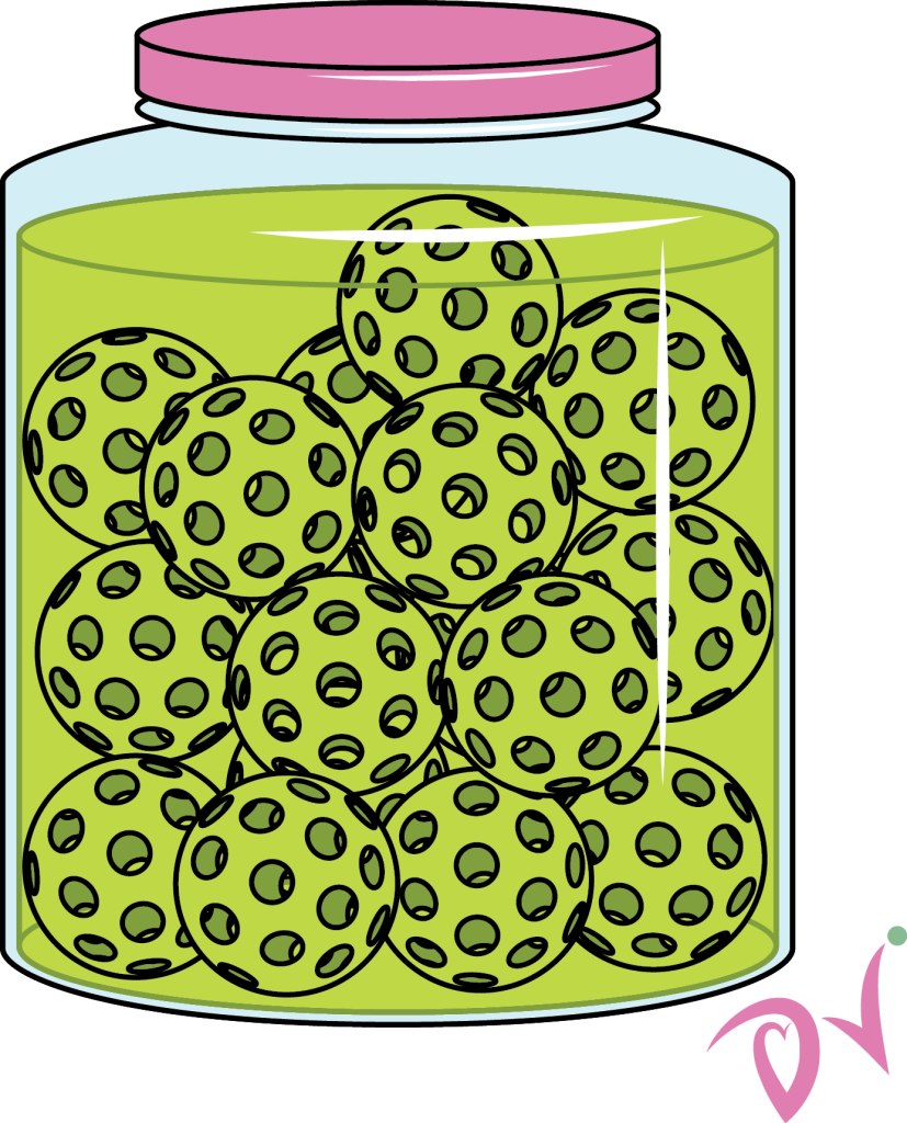
While the paddle was decided to not become the Dink Vibes logo, the design served as a cute simple graphic tee element. I also illustrated a pickle jar for an extra whimsical graphic tee.